New User Interface
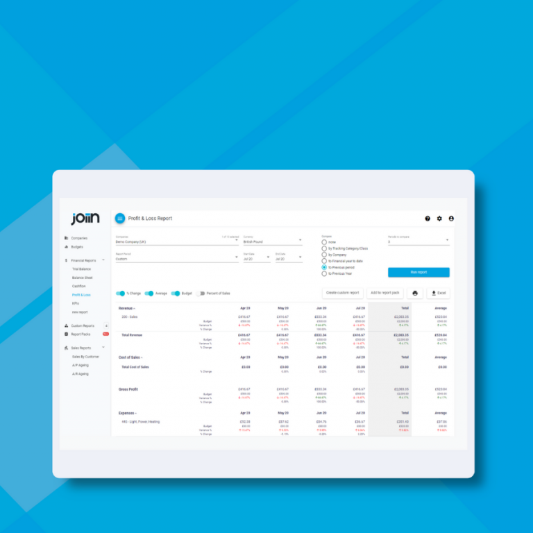
With our latest release we’re giving Joiin a makeover and moving a few things around to give it a more streamlined feel and make it easier to use.

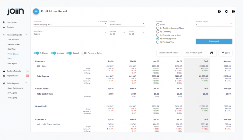
The Companies and Budgets menu items have been moved to the top of the left menu and we’ve moved some of the items in the left menu into our new Settings section – which can be accessed from the new Settings icon at the top right.

Our new Settings menu item is where you can access settings to control how Joiin works for you. These are existing sections that previously appeared on the left menu or under the Account menu at the top right. These are Reporting Configuration, Chart of Accounts, User Management, Budgets and Exchange Rates.

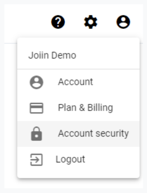
The Account menu at the top right has been trimmed back to include only items relating to your Joiin Account.

The Account menu now also includes the Account menu item which is a new addition – this is where you can change details of your account such as the account name. We’ll be adding more items to this section very soon.
The Account menu now also includes the Account menu item which is a new addition – this is where you can change details of your account such as the account name. We’ll be adding more items to this section very soon.
We hope you like the new look and, as always we’d love to hear your thoughts and feedback – get in touch with the Joiin team at hello@joiin.co and let us know what you think.


